about

CSS

What is CSS?

As of 2015, Cascading Style Sheets (CSS) is defined by the following specifications.

"You are what you do, not who you are"

The W3C & the CSS modules

The W3C Process

  1. Working Draft (WD)
  2. Candidate Recommendation (CR)
  3. Recommendation (REC)

CSS Snapshot 2015

CSS Terms

Selectors

A selector is the part of the CSS line that selects what element to target with the property/value pair.

CSS Selector

Selector sections

  • Universal selector: *
  • Type selector: E
  • Class selectors: E.warning
  • ID selectors: E#myid
  • Attribute selectors: E[foo]
  • Pseudo-classes: E:root
  • Pseudo-elements: E::before
  • Combinators: E F

*

any element

* {  
    margin: 0;  
    padding: 0;  
}
nav * {  
    border: 1px solid black;  
}

Universal selector (Level 2)

E

an element of type E

p {  
    margin: 0;  
    padding: 0;  
}
.sidebar h1 {  
    border: 1px solid black;  
}

Type selector (Level 1)

E[foo]

an E element with a "foo" attribute

a[href] {  
    background: #666;
    padding-left: 10px;

}

Attribute selectors (Level 2)

X [foo ~="bar" ]

an E element whose "foo" attribute value is a list of whitespace-separated values, one of which is exactly equal to "bar"
a[data-info~="external"] {  
    color: red;  
}  

a[data-info~="image"] {  
    border: 1px solid black;  
}
                   

Attribute selectors (Level 2)

X [foo ^ ="bar" ]

an E element whose "foo" attribute value begins exactly with the string "bar"
a[href^="http"] {  
    background: #333;  
    padding-left: 10px;  
}
                   

Attribute selectors (Level 3)

X [foo $="bar" ]

an E element whose "foo" attribute value ends exactly with the string "bar"
a[href$=".rar"] {  
    color: red;  
}
                    

Attribute selectors (Level 3)

X [foo *="bar" ]

an E element whose "foo" attribute value contains the substring "bar"
a[href*="naknak"] {  
    color: #1f6053; 
}
                   

Attribute selectors (Level 3)

X [foo |="en" ]

an E element whose "foo" attribute has a hyphen-separated list of values beginning (from the left) with "en"
a[href|="nak"] {  
    color: #1f6053; 
}
                   

Attribute selectors (Level 2)

E:root

an E element, root of the document
a:root {  
    color: #1f6053;  
}
                   

Structural pseudo-classes (Level 3)

E:nth-child(n)

an E element, the n-th child of its parent
li:nth-child(3) {  
    color: red;  
}
                   

Structural pseudo-classes (Level 3)

E:nth-of-type(n)

an E element, the n-th sibling of its type
p img:nth-of-type(3) {  
    border: 1px solid black;  
}
                    

Structural pseudo-classes (Level 3)

E:nth-last-of-type(n)

an E element, the n-th sibling of its type, counting from the last one
ul:nth-last-of-type(3) {  
    border: 1px solid black;  
}
                    

Structural pseudo-classes (Level 3)

E:first-child

an E element, first child of its parent
ul li:first-child {  
    border-top: none;  
}
                  

Structural pseudo-classes (Level 2)

E:last-child

an E element, last child of its parent
li:nth-last-child(2) {  
    color: red;  
}
                    

Structural pseudo-classes (Level 3)

E:first-of-type

an E element, first sibling of its type
.foo img:first-of-type{  
    border-top: none;  
}
                   

Structural pseudo-classes (Level 3)

E:last-of-type

an E element, last sibling of its type
.foo img:last-of-type{  
    border-top: none;  
}
                   

Structural pseudo-classes (Level 3)

E:only-child

an E element, only child of its parent
article p:only-child {  
    color: red;  
}
                   

Structural pseudo-classes (Level 3)

E:only-of-type

an E element, only sibling of its type
li:only-of-type {  
    font-weight: bold;  
}
                  

Structural pseudo-classes (Level 3)

E:empty

an E element that has no children (including text nodes)
p:empty {  
    display:none;
}
                  

Structural pseudo-classes (Level 3)

E:link, E:visited

an E element being the source anchor of a hyperlink of which the target is not yet visited (:link) or already visited (:visited)
a:link {  
    color:#333;
}
a:visited {  
    color:#666;
}
                  

The link pseudo-classes (Level 1)

E:active, E:hover, E:focus

an E element during certain user actions
a:active {  
    color:#333;
}
a:hover {  
    color:#666;
}
a:focus {  
    color:#000;
}
                  

The user action pseudo-classes (Level 1&2)

E:target

an E element being the target of the referring URI
http://example.com/html/top.html#section_2

*:target { color : red }
*:target::before { content : url(target.png) }
                   

Here, the :target pseudo-class is used to make the target element red and place an image before it, if there is one:

The target pseudo-class (Level 3)

E:lang(eu)

an element of type E in language "eu" (the document language specifies how language is determined)

Hau eukaraz da.

The :lang() pseudo-class (Level 2)

E:enabled, E:disabled

a user interface element E which is enabled or disabled
input:disabled{
    opacity:.6;
}
                  

The UI element states pseudo-classes (Level 3)

E:checked

a user interface element E which is checked (for instance a radio-button or checkbox)
input[type=radio]:checked {  
    border: 1px solid black;  
}
                    

The UI element states pseudo-classes (Level 3)

E::first-line

the first formatted line of an E element
p::first-line { text-transform: uppercase }
                    

The ::first-line pseudo-element (Level 1)

E::first-letter

the first formatted letter of an E element
p::first-letter { color: green; font-size: 200% }
                    

The ::before pseudo-element (Level 2)

E::before

generated content before an E element
.foo::before {
    content: "some text";
    display: block;
    width: 100px;
    height: 100px;
    background: pink;  
}
                   

The ::before pseudo-element (Level 2)

E::after

generated content after an E element
.foo::after {
    content: "some text";
    display: block;
    width: 100px;
    height: 100px;
    background: pink;  
}
                   

The ::before pseudo-element (Level 2)

E.warning

an E element whose class is "warning"
.warning {
    display: block;
    width: 100px;
    height: 100px;
    background: pink;  
}
                   

Class selectors (Level 1)

E#myid

an E element with ID equal to "myid".
#myid {
    display: block;
    width: 100px;
    height: 100px;
    background: pink;  
}
                   

ID selectors (Level 1)

E:not(s)

an E element that does not match simple selector s
div:not(.container) {  
    color: blue;  
}
                   

Negation pseudo-class (Level 3)

E F

an F element descendant of an E element
header h1{
    font-size:2em;
    color:#333;
}

Descendant combinator (Level 1)

E > F

an F element child of an E element
header > ul{
    font-size:2em;
    color:#333;
}
                   

    Child combinator (Level 2)

    E + F

    an F element immediately preceded by an E element
    header + h1{
        font-size:2em;
        color:#333;
    }


    Adjacent sibling combinator (Level 2)

    E ~ F

    an F element preceded by an E element
    header ~ h1{
        font-size:2em;
        color:#333;
    }
                       

    General sibling combinator (Level 3)

    Layout

    Modules

    Basic User Interface Module

    Level 3 (CSS3 UI)

    box-sizing

    box-sizing

    box-sizing: content-box | border-box | inherit;
                                    
    Box sizing

    Both elements have the same width (300px)

    conten-box
    border-box

    Reset the box sizing

    *{
        -webkit-box-sizing: border-box;
        -moz-box-sizing: border-box;
        box-sizing: border-box;
    }
                        

    resize

    resize

    resize: none|both|horizontal|vertical|inherit;
                                

    Flexible Box Layout Module

    Level 1

    In the cosmos, there is no refuge from change
    Carl Sagan
    CSS layout

    In the flex layout model, the children of a flex container:

    • Can be laid out in any direction
    • Can “flex” their sizes, either growing to fill unused space or shrinking to avoid overflowing the parent.
    • Both horizontal and vertical alignment of the children can be easily manipulated.
    • Nesting of these boxes (horizontal inside vertical, or vertical inside horizontal) can be used to build layouts in two dimensions.

    The axis

    CSS Flexbox
    • main axis: The main axis of a flex container is the primary axis along which flex items are laid out. It extends in the main dimension.
    • main-start: The flex items are placed within the container starting on the main-start side and going toward the main-end side.
    • main size: A flex item’s width or height, whichever is in the main dimension, is the item’s main size.
    • cross axis: The axis perpendicular to the main axis is called the cross axis. It extends in the cross dimension.
    • cross-start: Flex lines are filled with items and placed into the container starting on the cross-start side of the flex container and going toward the cross-end side.
    • cross size: The width or height of a flex item, whichever is in the cross dimension, is the item’s cross size.

     Resources

    Multi-column Layout Module

    Multi-column Layout

    .three-col {
        column-count: 3;
        column-gap: 20px;
        column-rule-color: #ccc;
        column-rule-style:solid;
        column-rule-width: 1px;
    }
                   
    Multi column layout

    Multi-column Layout

    ARRAINEK eta zuhaitzek elkarren antza dute. Antza dute uztaiengatik. Zuhaitzek enborrean dituzte. Enborrari zehar ebakia egin eta hantxe ageriko dira uztaiak. Uztai bakoitzeko urtebete, horrelaxe jakiten da zuhaitzaren adina zein den. Arrainek ere uztaiak dituzte, baina ezkatetan. Eta zuhaitzekin bezalaxe, uztai horiengatik dakigu zein den animaliaren adina. Arrainak beti ari dira handitzen. Gu ez, gu txikituz goaz behin heldutasunera iritsita. Gure hazkundea gelditu egiten da eta hezurrak elkartzen hasten dira. Uzkurtu egiten da pertsona. Arrainak, ordea, hil arte hazten dira. Gazte direnean azkarrago, urteetan aurrera egin ahala mantsoago, baina haziz doaz beti arrainak. Eta horrexegatik dituzte uztaiak ezkatetan. 12 Arrainen uztaia neguak sortzen du. Arrainak gutxien jaten duen aldia da negua, eta gose garai horrek arrasto ilun bat marrazten du ezkatan. Gutxiago hazten delako negu sasoian. Udan ez baina. Goserik ez dagoenean ez da arrastorik geratzen ezkatan. Uztai mikroskopikoa da arrainena, ez da itxura batean ikusten, baina hortxe dago. Zauri bat izango balitz bezala. Ondo itxi gabeko zauri bat. Eta uztaiak arrainetan legez, gertaera latzak geratu egiten dira gure memorian, gure bizitza markatu egiten dute, gure denboraren neurri bihurtu arte. Egun zoriontsuak, aldiz, azkar doaz, azkarregi, eta berehalaxe ahazten zaizkigu. Arrainetan negua dena, gizakietan galera da. Galerak zehazten du gure garaia, harreman baten bukaerak, maite dugun pertsona baten heriotzak. Galera bakoitza, uztai ilun bat sakonean.

    Style

    Modules

    Backgrounds and Borders Module

    Level 3

    multiple background

    multiple background

    background-image: url(flower.png), url(ball.png), url(grass.png); 
    background-position: center center, 20% 80%, top left, bottom right; 
    background-origin: border-box, content-box; 
    background-repeat: no-repeat; 


    * Each of the images is sized, positioned, and tiled according to the corresponding value in the other background properties. The lists are matched up from the first value: excess values at the end are not used. If a property doesn't have enough comma-separated values to match the number of layers, the UA must calculate its used value by repeating the list of values until there are enough.

    background-size

    background-size

    background-size: length|percentage|cover|contain;
    default
    100% 100%
    cover
    contain
    200px 300px

    border-radius

    CSS border radius

    border-radius

    border-*-*-radius: [ <length> | <%> ] [ <length> | <%> ];
    
    border-top-left-radius: 50px 50px;
                        

    box-shadow

    Box shadow

    inset

    box-shadow: inset 2px 2px 20px #333;
                    

    Text Decoration Module

    Level 3

    text-shadow

    CSS text shadow

    Color Module

    Level 3

    rgba

    rgba

    rbga (red,green,blue,opacity);
    .foo{
        color: rgba (255,255,255,.5);
    }
                    
    rgba(255,0,0,1)
    rgba(255,0,0,.5)
    rgba(255,0,0,.2)

    rgba(0,255,0,1)
    rgba(0,255,0,.5)
    rgba(0,255,0,.2)

    rgba(0,0,255,1)
    rgba(0,0,255,.5)
    rgba(0,0,255,.2)

    hsla

    hsla

    hsl(hue,saturation,lightness)
    background-color: hsl(360,100%,20%);

    Extended color keywords

    opacity

    opacity

    .foo {
        opacity: 0.5;
    }
                    

    Value betwen 0 and 1

    CSS Fonts module

    Level 3

    @font-face rule

    @font-face rule

    Allows for linking to fonts that are automatically fetched and activated when needed.

    @font-face {
        font-family: Gentium;
        src: url(http://example.com/fonts/Gentium.woff);
    }
                        
    p { font-family: Gentium, serif; }
                        

    Graphics

    Modules

    • Image Values and Replaced Content Module Level 3
    • Filter Effects Module Level 1
    • Compositing and Blending Level 1

    Image Values and Replaced Content Module

    Level 3

    gradients

    gradients

    <gradient> = [ 
    <linear-gradient> | <radial-gradient> | 
    <repeating-linear-gradient> | <repeating-radial-gradient> ]
                      
    background: linear-gradient(left, transparent 0%,#444 50%,transparent 100%);
                       

    Radial gradient

    background: radial-gradient(ellipse at center,  #ff99cd 0%,#ef017c 100%);
                       

    Vendor prefixes

    background: #444;
    background: -webkit-gradient(linear, left top, right top, color-stop(0%,transparent), color-stop(50%,#444), color-stop(100%,transparent));
    background: -webkit-linear-gradient(left, transparent 0%,#444 50%,transparent 100%);
    background: -moz-linear-gradient(left, transparent 0%, #444 50%, #transparent 100%);
    background: -ms-linear-gradient(left, transparent 0%,#444 50%,#transparent 100%);
    background: -o-linear-gradient(left, transparent 0%,#444 50%,transparent 100%);
    background: linear-gradient(left, transparent 0%,#444 50%,transparent 100%);
                       

    Object-fit

    Object-fit

    The ‘object-fit’ property specifies how the contents of a replaced element should be fitted to the box established by its used height and width.

    object-fit: fill | contain | cover | none | scale-down
                

    object-fit: fill

    object-fit: contain

    object-fit: cover

    object-fit: none

    object-fit: scale-down

    object-position

    object-position: 50% 50%;
                

    Filter Effects Module

    Level 1

    filter

    filter

    filter: efect();
                               

    Efects:

    blur | grayscale | drop-shadow | sepia | brightness | contrast | hue-rotate | invert | saturate | opacity 
                               

    none filter

    filter: grayscale(1);

    filter: sepia(1);

    filter: saturate(4);

    filter: hue-rotate(90deg);

    filter: invert(.8);

    filter: opacity(.5);

    filter: brightness(.5);

    filter: contrast(3);

    filter: blur(5px);

    filter: sepia(1) hue-rotate(200deg);

    filter: contrast(1.4) saturate(1.8) sepia(.6);

    Compositing and Blending

    Level 1

    Blending

    Blending is the aspect of compositing that calculates the mixing of colors where the source element and backdrop overlap.

    CSS backdrop

    Mix-blend-mode

    The blend mode defines the formula that must be used to mix the colors with the backdrop.

    <blend-mode> = normal | multiply | screen | overlay | darken | lighten | color-dodge |color-burn | hard-light | soft-light | difference | exclusion | hue | 
    saturation | color | luminosity
                    
    normal
    multiply
    screen
    overlay
    darken
    lighten
    color-dodge
    color-burn
    hard-light
    soft-light
    difference
    exclusion
    hue
    saturation
    color
    luminosity

    Background-blend-mode

    Defines the blending mode of each background layer.

    <blend-mode> = normal | multiply | screen | overlay | darken | lighten | color-dodge |color-burn | hard-light | soft-light | difference | exclusion | hue | saturation | color | luminosity
                    

    Must be applied in the same order as background-image. The first element in the list will apply to the layer that is on top. If a property doesn’t have enough comma-separated values to match the number of layers, the UA must calculate its used value by repeating the list of values until there are enough.

    div { 
        width: 200px;
        height: 200px;
        background-size: 200px 200px;
        background-repeat:no-repeat;
        background-image: linear-gradient(to right, #000000 0%,#ffffff 100%), url('arale.png');
        background-blend-mode: difference, normal;
    }
                        

    Shapes

    Motion

    Modules

    Transforms Module

    Level 1

    transform

    scale | rotate | skew | translate

    transform: transform-function; /* can list multiple, space-separated */
                        
    div {
        -webkit-transform: value;
        -moz-transform:    value;
        -ms-transform:     value;
        -o-transform:      value;
        transform:         value;
    }
                    

    transform: scale

    transform: scale(2,3);
                        

    transform: rotate

    transform: rotate(45deg);
                        

    transform: skew

    transform: skew(45deg);
                        

    transform: translate

    tranform: translate(x,y);
                        
    transform: translate(100px,40px;)
                        

    Transitions Module

    Level 1

    transition

    .foo {
        transition: [transition-property] [transition-duration] [transition-timing-function] [transition-delay];
    }
    
    div {
        transition: background 0.2s ease,padding 0.8s linear;
    }
    

    transition-property

    The ‘transition-property’ property specifies the name of the CSS property to which the transition is applied.

    div {
        transition: background 0.2s ease,padding 0.8s linear;
    }
    
    transition-property:background,padding;    
    

    transition-duration

    Defines the length of time that a transition takes.

    div {
        transition: background 0.2s ease,padding 0.8s linear;
    }
                        
    transition-duration: .2s;
                        

    transition-timing-function

    Describes how the intermediate values used during a transition will be calculated. It allows for a transition to change speed over its duration. These effects are commonly called easing functions.

    div {
        transition: background 0.2s ease,padding 0.8s linear;
    }
    
                        
    transition-timing-function:ease,linear;
                        

    transition-timing-function

    • linear
    • ease-in
    • ease-out
    • ease-in-out
    • step-start
    • step-end
    • cubic-bezier

    transition-delay

    Defines when the transition will start.

    div {
        transition: background 0.2s ease 5s,padding 0.8s linear;
    }
                        
    transition-delay:5s, 0 ;
                        
    transition: background 2s ease-out;
                
    transition: border .5s ease-out;
                        

    Animations

    Animation

    This CSS module describes a way for authors to animate the values of CSS properties over time, using keyframes. The behavior of these keyframe animations can be controlled by specifying their duration, number of repeats, and repeating behavior.

    @keyframes resize {
      0% {
        padding: 0;
      }
      50% {
        padding: 0 20px;
        background-color:rgba(255,0,0,0.2);
      }
      100% {
        padding: 0 100px;
        background-color:rgba(255,0,0,0.9);
      }
    }
    
    #box {
      animation-name: resize;
      animation-duration: 1s;
      animation-iteration-count: 4;
      animation-direction: alternate;
      animation-timing-function: ease-in-out;
    }

    Timing functions for keyframes

    ‘animation-name’ 
    ‘animation-duration’ 
    ‘animation-timing-function’ 
    ‘animation-iteration-count’ 
    ‘animation-direction’ 
    ‘animation-play-state’ 
    ‘animation-delay’ 
    ‘animation-fill-mode’ 
    ‘animation’ Shorthand 

    Media Queries

    Modules

    @media

    media queries

    @media screen and (min-width:600px){ 
        body{background: pink;
    }
                                

    media features

    • width
    • height
    • device-width
    • device-height
    • orientation (landscape, portrait)
    • aspect-ratio
    • device-aspect-ratio
    • color
    • color-index
    • monochrome
    • resolution
    • scan
    • grid

    How to use

    Call from <head>

    <link rel='stylesheet' media='screen and (min-width: 701px) and (max-width: 900px)' href='css/medium.css' /> 

    Inside the CSS file

    @media screen {
          body {width: 75%; }
    }
    @media print {
          body {width: 100%; }
    } 
    @media all and (max-width: 699px) and (min-width: 520px), (min-width: 1151px) {
        background: #ccc;
    } 

    Responsive Web Design

    content is king 
    Bill Gates 1996

    The content must be accessible from any device

    Our options

    • Do nothing (the device zooms)
    • Native App
    • Double version
    • Responsive web design
    • Webapp

    It depends on the project

    Some advantages of RWD

    • Reduced development costs 
    • Reduced maintenance
    • Unique URL
    • Does not require licenses or bureaucracies

    The information architecture is very important

    We have to prioritize content to discriminate the secondary

    Mobile First

    Progresive enhacement vs. Graceful degradation

    RWD is not only mq

    • Layout
    • Media queries
    • Multimedia
    • Contenido

    Layout

    Relative units

    • em
    • %
    • vw vh

    target/content=result

    1em = 16px

    http://pxtoem.com/

    Patterns

    http://bradfrostweb.com/blog/web/responsive-nav-patterns/

    Frameworks

    Multimedia

    We have to adapt media elements

    and not only to change the width. XD
    .img{
        max-width: 100%;
    }
                        

    <picture> & srcset attribute

    Picture


    <picture>
        <source srcset="med.jpg 1x, med-hd.jpg 2x" media="(min-width: 40em)" /> 
        <source srcset="sm.jpg 1x, sm-hd.jpg 2x" /> 
        <img src="fallback.jpg" alt="" />
    </picture>
                       

    srcset

    <h1><img alt="The Breakfast Combo"
        src="banner.jpeg"
        srcset="banner-HD.jpeg 2x, banner-phone.jpeg 320w, banner-phone-HD.jpeg 320w 2x">
    </h1>
                                

    Server side

    • Adaptive Images [go]
    • Image Resizer [go]

    Don´t use .png for icons

    http://icomoon.io/

    Video

    .video {
        max-width: 100%;
        height: auto;
    }
                       
    [with JS]

    Media solution

    <video controls> 
        <source src="parrots-small.mp4" type="video/mp4" media="all and (max-width:480px)"> 
        <source src="parrots-small.webm" type="video/webm" media="all and (max-width:480px)"> 
        <source src="parrots.mp4" type="video/mp4"> 
        <source src="parrots.webm" type="video/webm"> 
    </video>
                        

    iframe from youtube

    <iframe>

    embedresponsively.com/

    <style>
    .embed-container {
        position: relative;
        padding-bottom: 56.25%;
        padding-top: 30px;
        height: 0;
        overflow: hidden;
        max-width: 100%;
        height: auto;
    }
    .embed-container iframe, .embed-container object, .embed-container embed{
        position:absolute;
        top: 0;
        left: 0;
        width: 100%;
        height: 100%; 
    }
    </style>
    <div class='embed-container'><iframe src='http:http://www.youtube.com/embed/vqSo-iZ5D8E' frameborder='0' allowfullscreen></iframe></div>
                        

    What's new

    CSS Snapshot 2015

    Support

    Cross Browser & cross device

    Progresive enhancement & graceful degradation

    1.Follow the standards

    [info]

    2.Use CSSLint

    [info]

    3. Reset, don´t forget it.

    [info]

    4. Can I use?

    [info]

    5.Trust the cascade

       
    .foo{
        background-color: #ccc; /* old browsers */
        background-color: rgba(0,0,0,0.2); /* supported browsers */
    }
                            

    6. The vendor prefixes are dead but still we have to use them

    background: $color2; /* Old browsers */ 
    background: -moz-linear-gradient(left, $color1 0%, $color2 75%, $color3 100%); /* FF3.6+ */ 
    background: -webkit-gradient(linear, left top, right top, color-stop(0%,$color1), color-stop(75%,$color2), color-stop(100%,$color3)); /* Chrome,Safari4+ */ 
    background: -webkit-linear-gradient(left, $color1 0%,$color2 75%,$color3 100%); /* Chrome10+,Safari5.1+ */ 
    background: -o-linear-gradient(left, $color1 0%,$color2 75%,$color3 100%); /* Opera 11.10+ */ 
    background: -ms-linear-gradient(left, $color1 0%,$color2 75%,$color3 100%); /* IE10+ */ 
    background: linear-gradient(to right, $color1 0%,$color2 75%,$color3 100%); /* W3C */
                 

    Modernizr


    [info]

    Polyfills


    [info]

    CSS processors

    Preprocessors

    Sass

    sass-lang.com/

    What is Sass?

    It's a tool to improve the CSS workflow

    What for?

    It allows to use variables, functions, operations... in the CSS

    Its like adding steroids

    Advantages


    Work faster

    Create reusable code

    Create maintainable code

    Arquitecture for a Sass project


    |– base/ 
    |   |– _reset.scss       # Reset/normalize 
    |   |– _typography.scss  # Typography rules 
    |   ...                  # Etc… 
    | 
    |– components/ 
    |   |– _buttons.scss     # Buttons 
    |   |– _carousel.scss    # Carousel 
    |   |– _cover.scss       # Cover 
    |   |– _dropdown.scss    # Dropdown 
    |   |– _navigation.scss  # Navigation 
    |   ...                  # Etc… 
    | 
    |– helpers/ 
    |   |– _variables.scss   # Sass Variables 
    |   |– _functions.scss   # Sass Functions 
    |   |– _mixins.scss      # Sass Mixins 
    |   |– _helpers.scss     # Class & placeholders helpers 
    |   ...                  # Etc… 
    | 
    |– layout/ 
    |   |– _grid.scss        # Grid system 
    |   |– _header.scss      # Header 
    |   |– _footer.scss      # Footer 
    |   |– _sidebar.scss     # Sidebar 
    |   |– _forms.scss       # Forms 
    |   ...                  # Etc… 
    | 
    |– pages/ 
    |   |– _home.scss        # Home specific styles 
    |   |– _contact.scss     # Contact specific styles 
    |   ...                  # Etc… 
    | 
    |– themes/ 
    |   |– _theme.scss       # Default theme 
    |   |– _admin.scss       # Admin theme 
    |   ...                  # Etc… 
    | 
    |– vendors/ 
    |   |– _bootstrap.scss   # Bootstrap 
    |   |– _jquery-ui.scss   # jQuery UI 
    |   ...                  # Etc… 
    | 
    | 
    `– main.scss             # primary Sass file 
                       

    The sintax

    SCSS

    $blue: #3bbfce ;
    $margin: 16px ;
    .content-navigation {
     border-color: $blue ;
     color: darken($blue, 9%) ;
    }
    .border {
     padding: $margin / 2 ;
     margin: $margin / 2 ;
     border-color: $blue ;
    }

    SASS

    $blue: #3bbfce;
    $margin: 16px;

    .content-navigation
     border-color: $blue;
     color: darken($blue, 9%);

    .border
     padding: $margin / 2;
     margin: $margin / 2;
     border-color: $blue;

    The base

    Variables

    Mixins

    Nesting

    Inheritance

    Imports

    Color functions

    Operations

    Functions

    Variables

    $

    $color: #0982c1;

    $width: 1024px;

    $style: dotted;


    body {

     color: $color ;

     border: 1px $style $color ;

     max-width: $width ;

    }


    CSS output

    body {

    color : #0982c1;

    border : 1px dotted #0982c1;

    max-width : 1024px;

    }

    Mixins

    @mixin error ($width: 2px) {

        border: $width solid #F00;

        color: #F00;

    }

    .generic-error {

        padding: 20px;

        @include error () ;

    }

    .login-error {

        width:100px;

        @include error (5px) ;

    }

    .generic-error {

        padding : 20px;

        border : 2px solid #f00;

        color : #f00;

    }

    .login-error {

        width :100px;

        border : 5px solid #f00;

        color : #f00;

    }

    Nesting

    section {

        margin : 10px;

        nav {

            height : 25px;

            a {

                color : #0982C1;

               & :hover {

                  text-decoration : underline;

                 }

               }

           }

       }

    section {

    margin : 10px;

    }

    section nav {

    height : 25px;

    }

    section nav a {

    color : #0982C1;

    }

    section nav a :hover {

    text-decoration : underline;

    }

    Inheritance

    .block {

    margin: 10px 5px;

    padding: 2px;

    }

    p {

    @extend .block ;

    border: 1px solid #EEE;

    }

    ul, ol {

    @extend .block ;

    color: #333;

    }


    .block, p, ul, ol {

    margin : 10px 5px;

    padding : 2px;

    }

    p {

    border : 1px solid #EEE;

    }

    ul, ol {

    color : #333;

    }

    @import

    /* file .scss */

    body {

     background: #EEE;

    }


    @import "reset.css" ;

    @import "file" ;

    p {

    background: #0982C1;

    }

    @import "reset.css" ;

    body {

    background: #EEE;

    }

    p {

    background: #0982C1;

    }

    Color  functions

    lighten ( @color , 10%); /*10% lighter than @color */

    darken ( @color , 10%); /*10% darker than @color */

    saturate ( @color , 10%); /*10% more saturated than @color */

    desaturate ( @color , 10%); /*10% less saturated than @color */


    $color : #0982C1;

    h1 {

    background: $color ;

    border: 3px solid darken( $color , 50%) ;

    }

    Operations

    $width :960px;

    $items :6;


    body {

    margin: (14px / 2);

    top: 50px + 100px;

    right: 100px - 50px;

    left: 10 * 10;

    }

    p {width: $width / 2;}

    li {
       float: left;
       width: $width / $items - 10px;

       padding:0 5px;

    }

    Best practices

    Sass is only a tool, if your code is bad, the output will be even worse.

    Dry

    • Don´t Repeat Yourself
    • Clean code
    • Maintainable
    • Reusable

    Traps

    • The mixin, duplicates code. It´s easy to get a very bloated code if we don´t pay attention on it.
    • Many levels of nesting causes a very dependent and inflexible code. Avoid deep nesting.

    Postprocessors

    PostCSS

    PostCSS is a tool for transforming styles with JS plugins. These plugins can support variables and mixins, transpile future CSS syntax, inline images, and more.

    Autoprefixer

    PostCSS plugin to parse CSS and add vendor prefixes to CSS rules using values from Can I Use.

    Gulp

    Gulp

    Automate and enhance your workflow

    Best practices

    CSS Arquitecture

    DRY (Don´t Repeat Yourself)

    Avoid extra selectors

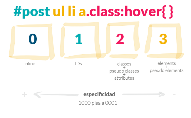
    body #container .someclass ul li {....} Wrong
                        
    .someclass li {...}Correct
                        

    Beware of
    specificity

    The
    name
    matters

    • BEM
    • Atomic design

    smacss

    smacss.com/

    About

    This is a summary of CSS modules , explaining the syntax, examples and some resources. For further information go to W3C

    +

    some CSS tools & techniques

    About

    with by
    naiara abaroa

    @nabaroa

    Licencia Creative Commons

    CreditsCreative commons

    Engine used: http://lab.hakim.se/reveal-js